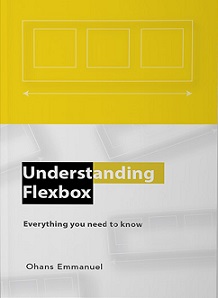
Understanding Flexbox: Everything You Need to Know
Overview & Synopsis
The CSS flexible box model, known as flexbox, is a new layout tool that can help you build flexible websites painlessly. It is powerful, easy to learn, and easy to use. According to the specification, the Flexbox model provides for an efficient way to layout, align, and distribute space among elements within your document - even when the viewport and the size of your elements is unknown and/or dynamic.
Indexed from repository: FreeComputerBooks.com
(
freecomputerbooks.com)
Keyboard Shortcuts:
← / → for pages • + / - for zoom • 0 to fit width
Powered by Mozilla PDF.js v3.11
Document Information
| Document Title | Understanding Flexbox: Everything You Need to Know |
|---|---|
| Author / Organization | Ohans Emmanuel |
| Subject & Discipline | Cascading Style Sheets (CSS), HTML5, HTML, XHTML, and DHTML, JavaScript (jQuery, Node.js, etc.), Android Development and Programming, Mobile Devices Development and Programming |
| Categories | Cascading Style Sheets (CSS) |
| Resource Verification | ✓ Verified Direct PDF Available |
| Alternative Mirrors & Links | |
| Original Host Website |
FreeComputerBooks.com
(freecomputerbooks.com)
|
| File Format | application/pdf (Portable Document Format) |
| Reported File Size | 3823.5 KB (3,915,214 bytes) |
| Language | ENGLISH |
| Catalog ID | DOC-34608 |
| Original Source Link | Visit Source Page on freecomputerbooks.com » |